
In this post, we discuss the distribution of incomes across California’s counties based on data from personal income tax returns filed with the state’s Franchise Tax Board (FTB).
Income Distribution Data Sources. The most common source for data on the state’s income distribution is the U.S. Census Bureau’s American Community Survey (ACS). Its annual samples of about 370,000 California households are large enough to model the state’s distribution, but the county-level subsamples in all but the largest counties are too small to conclude much about the counties’ distributions.
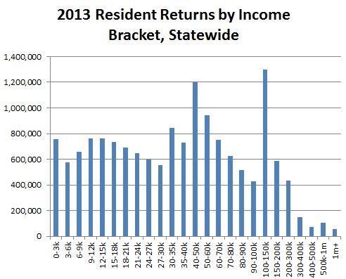
Fortunately, FTB provides annual county-level data every year for households that file California state income tax returns. FTB was able to assign nearly 15.5 million resident returns (more than 99.9 percent of the state total) to one of the state’s 58 counties in 2013, the most recent year for which county data is available. (For the remaining returns, a county was unable to be identified for various reasons.) With the number of tax returns being more than 40 times larger than the ACS sample, it is possible to use the returns to draw conclusions about income distributions in almost all of California's counties.
There are some important differences between the FTB and ACS datasets apart from sample size. Neither dataset is perfect. Unlike the ACS, FTB’s income measure excludes some types of income that are not taxed in California (such as Social Security and certain pension payments) and includes capital gains on the sales of assets such as stocks and real estate. Another difference is that the ACS covers all types of households, while FTB’s sample is necessarily restricted to people who filed an income tax return. Many California households are not legally required to file a return, including many lower-income households. At the same time, some individuals with other sources of income or support (which may or may not be required to be reported) are included in the lower-income brackets. Therefore, while the FTB data cannot show a county’s entire income distribution accurately, this data seems to be reasonably accurate for the majority of each county’s population that files a state income tax return.
How to Read These Graphics. FTB’s 2013 county tax return data (see Table B-7) divides the income distribution into 25 brackets shown in the figures below. If a tax return (that is, a single, joint, married filing separately, widow/widower, or head-of-household return) reports income before deductions of $55,000, for example, that return is included in the “50-60k” ($50,000-$60,000) bracket. We use FTB’s reported tax brackets, even though the income brackets are quite small at the lower end of the income distribution. An advantage of using FTB’s reported tax brackets is that for the state as a whole, all but the highest income brackets included hundreds of thousands of returns in 2013, as shown below.
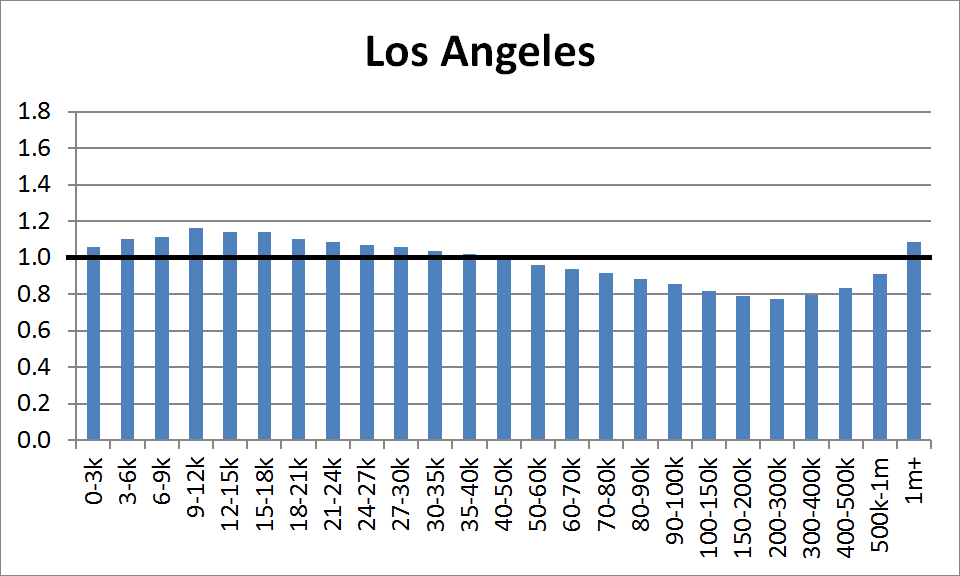
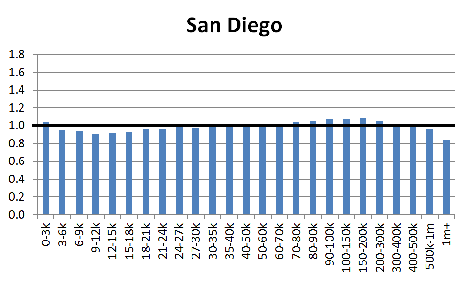
For the rest of this post, the graphics displayed compare selected counties’ distributions to the statewide distribution based on the 2013 FTB tax return data. (In a separate post here, we display all of the available county distributions.) These graphics compare the relative frequency of each income bracket in that county compared to its statewide frequency. For example, 5.83 percent of Los Angeles County filers reported income between $50,000 and $60,000 compared to 6.08 percent statewide. Los Angeles County’s relative frequency for the $50,000-$60,000 income bracket is 5.83 divided by 6.08, or 0.96. Because that income bracket is below 1.00, the proportion of Los Angeles County’s 2013 tax returns with income in that bracket is less than that proportion for California as a whole. In other words, tax returns reporting $50,000-$60,000 of income are slightly less common in Los Angeles County as compared to the state as a whole.
Los Angeles County. Los Angeles County’s distribution does not resemble any other county’s in the state. After about $15,000, the proportion of taxpayers in the county relative to the state as a whole falls gradually until about the $300,000 level, after which point it rises again. In the $1 million-plus bracket, Los Angeles County has a level of just over 1, which means its proportion of 2013 filers with income above $1 million was a bit greater than the state as whole. It is one of just nine counties with an above-average share of filers with income above $1 million (the other counties being Contra Costa, Marin, Napa, Orange, San Francisco, San Mateo, Santa Barbara, and Santa Clara, all of which are displayed here).
San Diego County. San Diego County comes closer to the statewide average distribution than any other county does. The bars displayed for its tax brackets rise slowly through most of the income distribution from just below 1 to just over 1. After $200,000, the bars trend slightly downward, with returns of $1 million and greater somewhat below the statewide average.
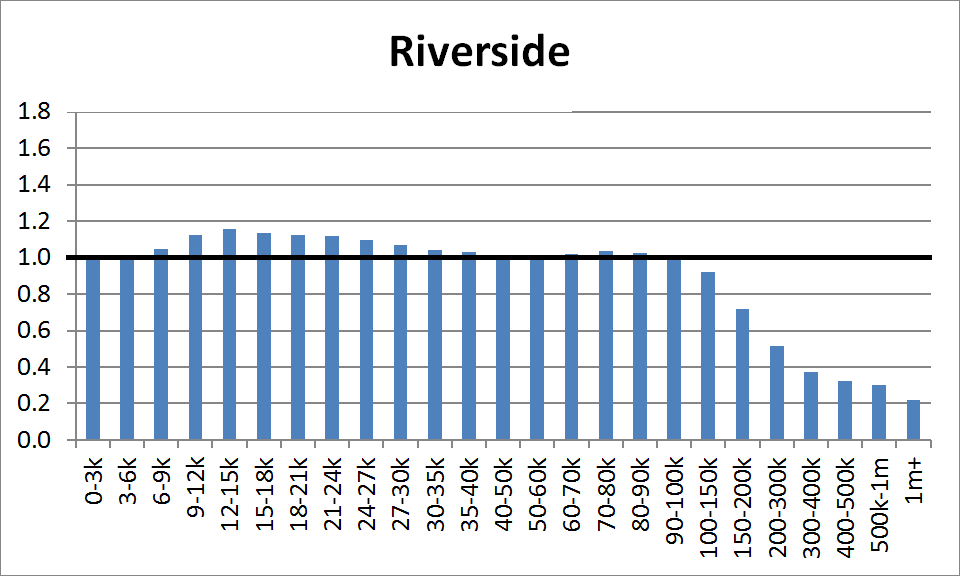
Riverside County and Others. Riverside County’s distribution mirrors the state up to $100,000 of income but declines sharply beyond that point. San Bernardino County’s distribution is almost identical. So are the distributions of the following counties: Kern, San Joaquin, Stanislaus, and various North State counties, including Butte, Del Norte, Humboldt, Shasta, Sutter, and Yuba, all of which are displayed here. (All of these counties have a correlation of at least 0.95 with Riverside County.) Riverside County’s distribution is typical for California counties that lack major concentrations of affluent people.
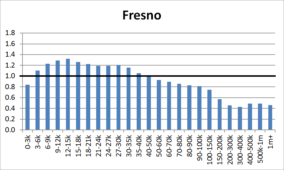
Fresno and Some Other Southern San Joaquin Valley Counties. Fresno County and most of the other southern San Joaquin Valley counties (all displayed here) have distributions that consistently slope downward beyond the very lowest income levels where people often are not required to file. Fresno County has a higher concentration of lower-income filers than Riverside County does, but it also has relatively more filers with income above $300,000. Tulare County's distribution is very similar to Fresno County's. (Statistically, they were the two most correlated counties in the state.)
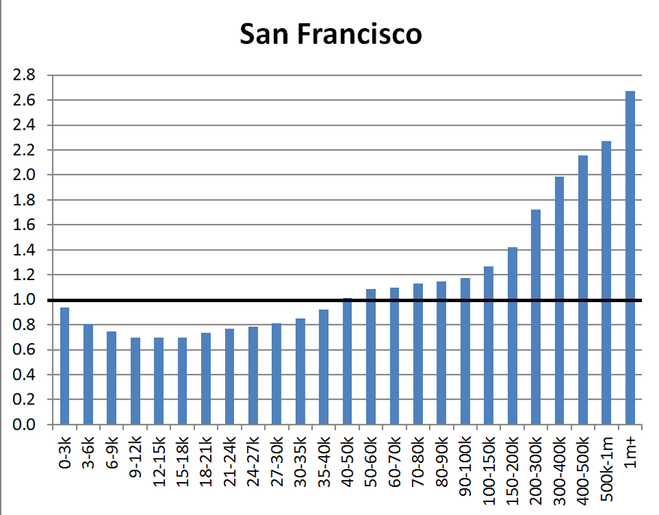
San Francisco, San Mateo, Marin, and Santa Clara Counties. San Francisco’s FTB income distribution is sharply tilted toward the upper income brackets. San Mateo County and Marin County are the two other counties closely correlated with San Francisco, with distributions even more tilted toward the top-end of the income scale. Santa Clara County—which paid more in state personal income taxes in 2013 than any other county except Los Angeles—also has a distribution tilted toward the upper income brackets. (All of those counties' distributions are displayed here.) Given California’s PIT rate structure—in which the tax rate increases as incomes increase—the income distribution in these counties helps explain why the average Bay Area taxpayer pays much more in income taxes than the average taxpayer in other parts of California.
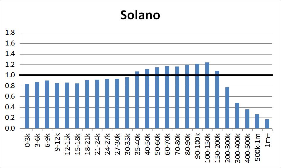
Solano County. Solano County, according to the FTB data, appears to be the most distinctly middle-class county in the state, with well above-average frequency of filers with income between $35,000 and $200,000 and well below average frequency of filers with income below $35,000 or above $200,000. While Solano County is more affluent overall than Fresno County is, it has a much lower frequency of filers with income over $400,000.
As noted above, an accompanying post here displays the 2013 FTB income tax return distributions of all counties in the state with the exception of Alpine, which did not have enough filers for FTB to provide usable data. In addition, some of the upper income brackets in some of the smallest counties had fewer than ten filers, and in these cases state confidentiality laws require FTB to blur the data for at least two brackets in the county. As a result, these brackets have imputed data.
Follow @LAOEconTax on Twitter for regular California economy and tax updates.